More
Сhoose
Client: Maisha Naturals Uganda
Date: March 2023
Service: Brand Identity & Packaging Design
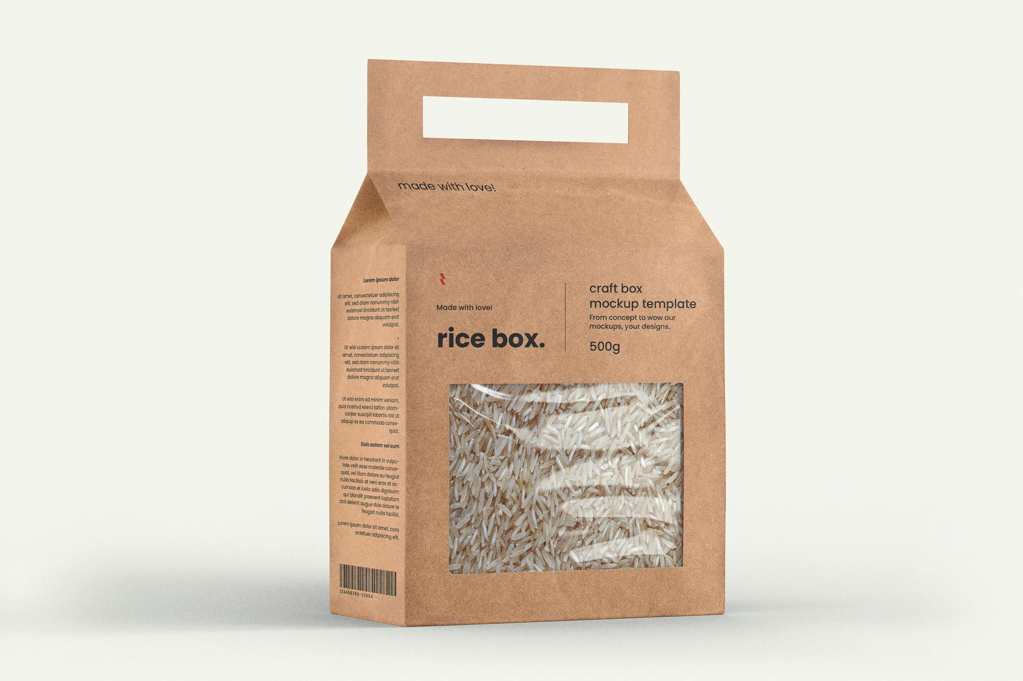
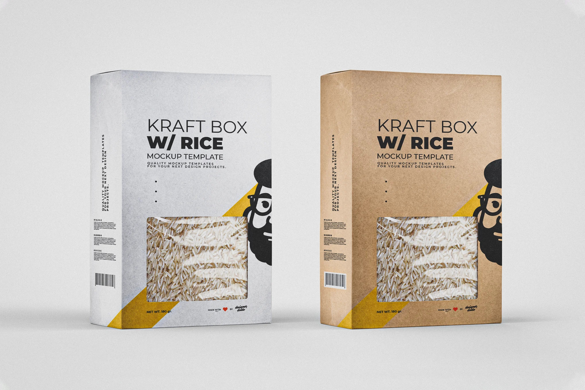
When the shelf is the pitch.
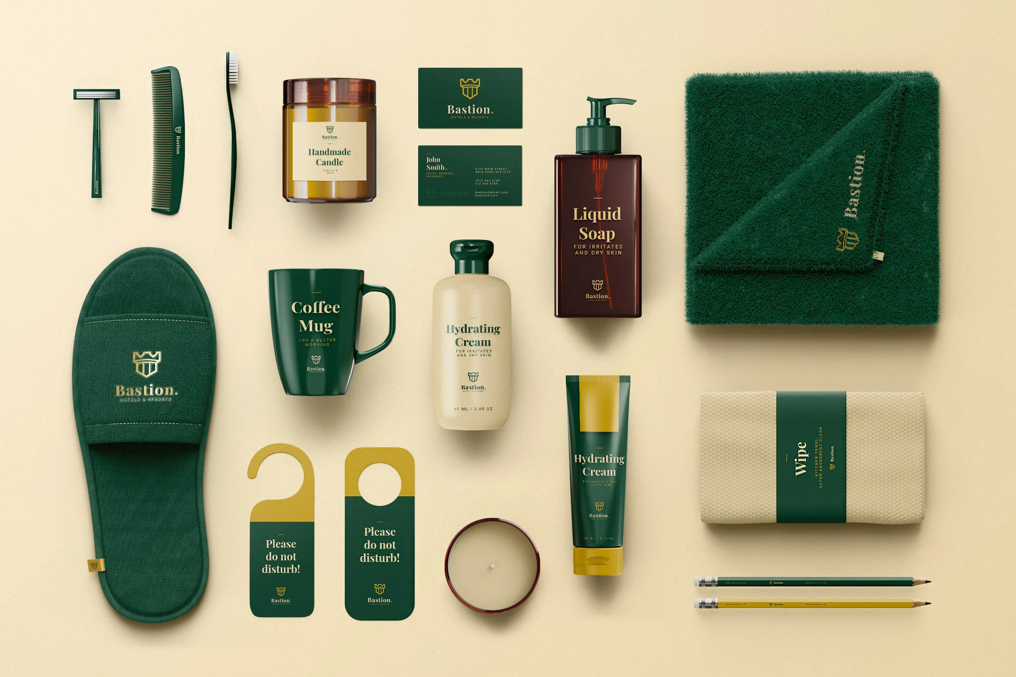
Maisha Naturals came to us with a product that deserved better than generic shelf space. The brief: build a visual identity and packaging system that communicated natural origin, premium quality, and East African provenance — without relying on the tired visual language most organic brands default to.
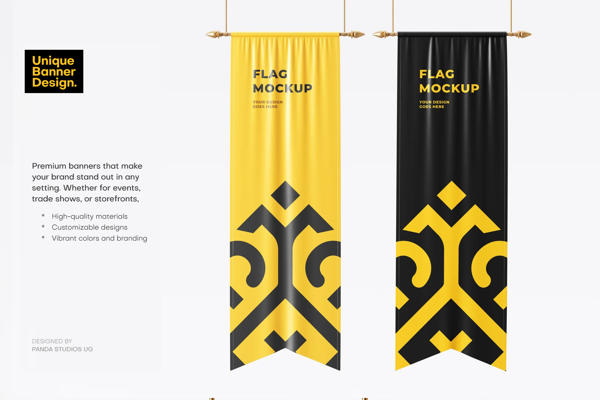
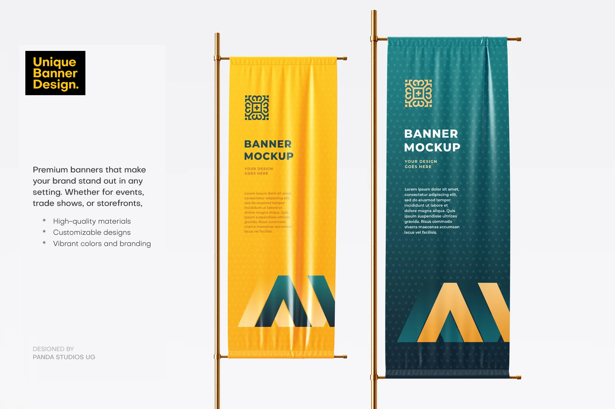
The result was a complete packaging identity built around honest form — clean typography, an earthy but refined colour palette, and label architecture that communicates the right information to the right eye in under three seconds. From product labels to event displays and market banners, every execution was built to work together as a single brand system.
Your product deserves packaging that sells it before anyone reads the label.